Make the conscious choice visible — in the basket and on the shelf
Klimakurven works out what your groceries cost the climate, product by product, traced to public sources. The goal is two-sided: make it easy for you to choose more consciously in the basket, and make it visible to the stores which products are actually pulling their own range toward a more sustainable one.
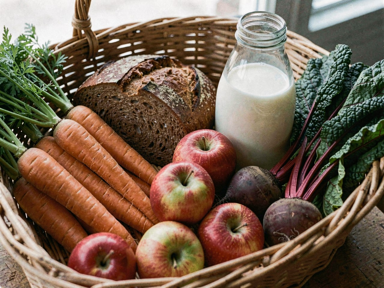
Two sides of the same problem
For the shopper
Right now a product's climate footprint is invisible on the shelf. Two packs of minced meat can look alike and still differ tenfold in footprint. Klimakurven shows the difference, so the conscious choice becomes possible — not just for the shopper who already knows what to look for.
For the stores
A store that curates its range more selectively — less of the heaviest, more of the light — moves more than any single customer can. Klimakurven makes that selection visible and comparable, so openness about a range becomes something stores can actually compete on, not just claim.
Data as of 2026-09-17 12:57 UTC (score run #14)
No product arrives for free
Before a product reaches your basket it has been through five stages — and each one cost the climate something. The figures below aren't an illustration: they are the average across the 2528 products we have scored, weighted by how much each product actually emits.
 1
1
The soil, the feed, the fertiliser, the animals — and the methane from ruminant digestion. Plus the nature cleared to make room. Almost always the heaviest stage.
 2
2
Slaughter, dairy, baking, freezing. The energy to turn a raw ingredient into something that can sit on a shelf.
 3
3
Plastic, cardboard, glass, cans. A small share per kg — but the most heavily packaged product is rarely the lightest one.
 4
4
Ship, truck, rail — or plane. Normally a small share. If it's flown, that turns the whole picture upside down.
 5
5
Chillers, freezers, lighting and storage. By far the smallest stage per kg in CONCITO's figures — but the only one that runs around the clock, all year.
Average product in our data: 6.60 kg CO2e per kg · This split describes the products we have scored so far, not Danish food consumption in general — and it shifts as we score more.
It isn't just about distance
Three real comparisons from our own data, not invented numbers, show what actually drives the difference in climate footprint.
A longer journey changes less than you'd think
Both shipped or trucked to Denmark, neither flown. The Zimbabwean orange has travelled far further than the Danish carrot — and yet transport's share of the total footprint stays small for both.


But when something is flown, that changes everything
Same idea — imported fruit — but blueberries out of Danish season are typically flown. Transport goes from a small share of the footprint to dominating it completely.

What you eat outweighs where it's from
Both 100% Danish. No transport, no import — and yet the difference is over 150-fold. Origin is rarely the main story; what it is, usually is.

Other = processing + packaging + chilling and store operations
What do we calculate, and what does a language model guess?
Stores
See what we've calculated for each store so far. Coverage always sits next to any figure — low coverage isn't hidden, it's part of the story.
Climate index is a 0–100 figure for the store: how light its range is climate-wise, how much it discloses, and what it does about packaging and food waste. Higher is better. Data coverage is a different thing entirely — it says how much of a typical shopping basket we have measured for that store at all. 69% means we have at least three scored products in the categories that together make up 69% of the basket. It does not mean 69% of the store's products are scored. Below 60% coverage we do not rank stores against each other.
Recomputed in your browser from the same numbers already shown for each store — nothing is sent to us, and a store's official index does not change. Most stores here have promotion-only data, so mind the uncertainty in the methodology before reading much into a small difference.


How can you help?
Two things you can actually do right now. Think a figure looks wrong or is missing important context? Go to that product's own page and use "Comment on this product" near the bottom — comments get read through the next time the analysis is re-run. And: if you scan barcodes in Open Food Facts' own app, that improves both that database and ours, with nothing extra needed here.